Agent ecosystem designed—then
redesigned.


Rethinking how users discover and navigate Creatify’s AI Agent—redesigning Skills, structuring complex AI workflows, and exploring a more discoverable homepage experience.
Agent ecosystem designed—then
redesigned.
33 conversations with real Creatify
users.



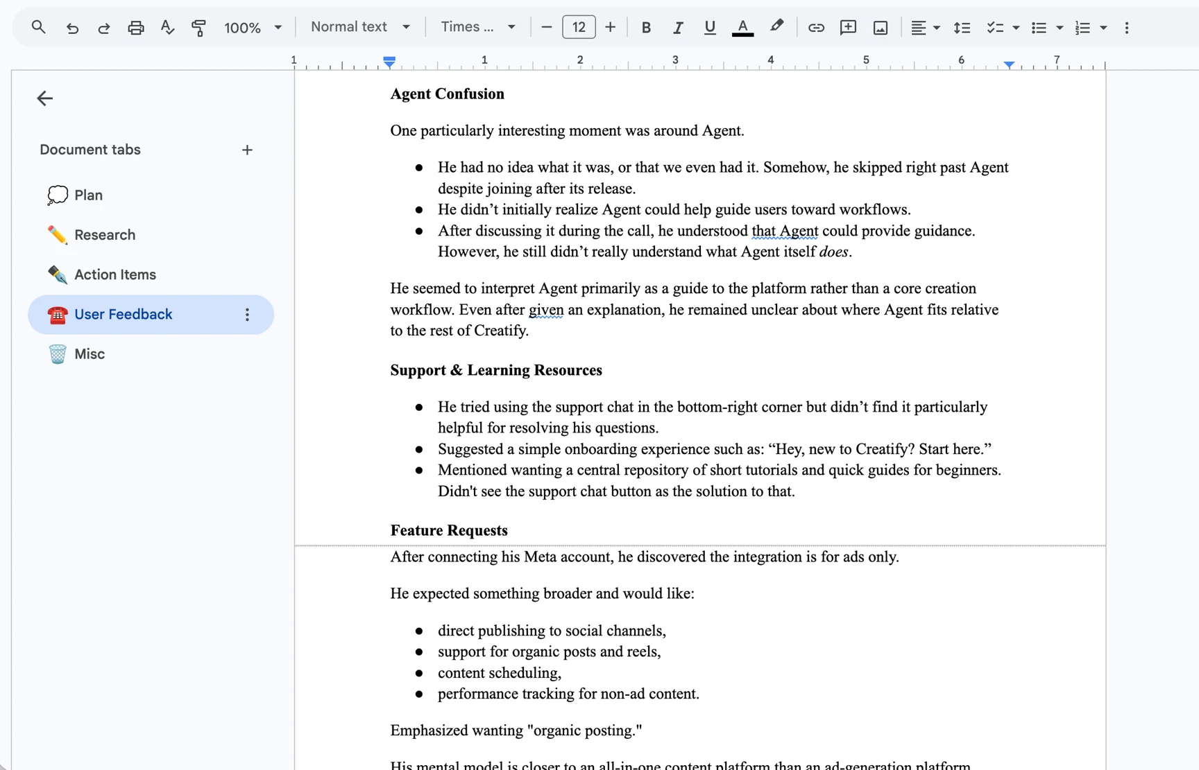
“I want to know how many credits this will use before I generate.”
“A tutorial would be really helpful.”
“I wasn’t sure what Agent did.”
“It looks cool—there’s just a lot going on at once.”
“The results look so human compared to other tools.”
“I wish I had more control over the final output.”
Chat, meet structure.
Designed it. Coded it. Shipped it.







38% more Agent Skill sessions post-launch.

As Creatify’s sole product design intern, I redesigned how users discover and use Agent—across Skills, in-chat workflows, navigation, and its homepage.
I also stepped into design engineering, moving from Figma into production code to implement, open PRs, and ship live.
As Agent grew more capable, its best features got harder to find and understand.
Before I redesigned it, Agent went through two versions. V1 had a strong visual identity but hid its best features. The V2 that replaced it was cleaner but more generic, and its features stayed just as hidden.

 Colorful visual identity
Micro-animations
Colorful visual identity
Micro-animations
 Features hidden
Didn’t match other pages
Features hidden
Didn’t match other pages
 Clean & sleek
Features hidden
Generic
Lack of animations
Clean & sleek
Features hidden
Generic
Lack of animations
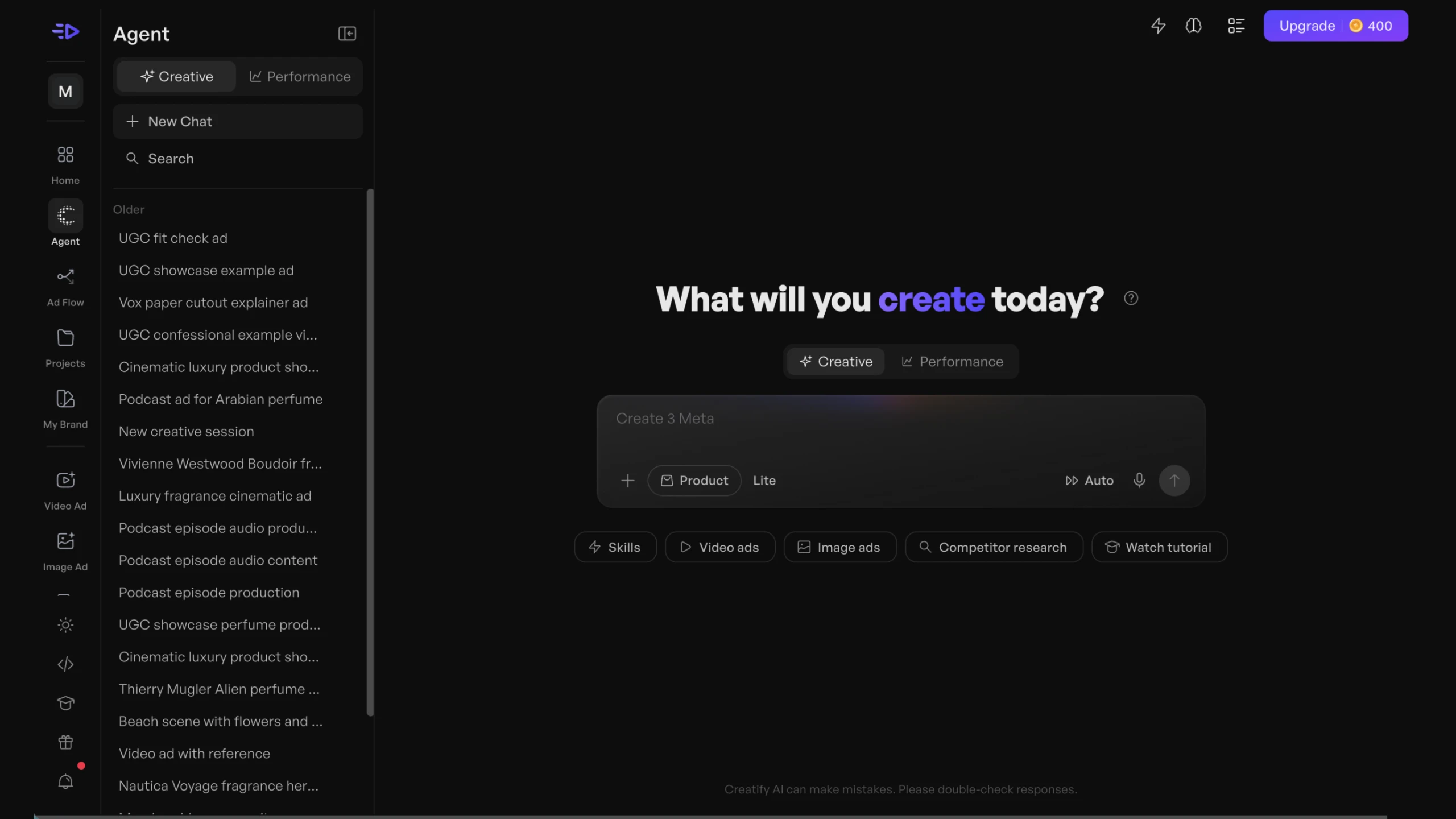
How might we make Agent’s capabilities easier to understand—and the experience unmistakably Creatify?
Was the friction I saw in Agent a one-off, or a pattern across all of Creatify? I looked at it from four angles: analytics, user calls, competitor audits, and product audits.
Users stalled at the same moments: choosing a workflow, reaching a first generation, and understanding credit costs. About half of users who started an ad never rendered it.
In 33 calls, users said capabilities were hard to discover and credits made them cautious. They also valued Creatify’s color and personality.
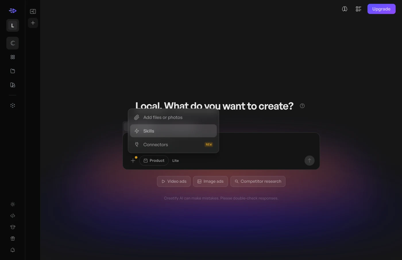
Creatify hid Skills behind an unlabeled + menu and a “/” command, while competitors like Higgsfield made similar features browsable.
PostHog showed users losing momentum at the same few moments. Many struggled to choose the right workflow and to reach their first generation. Later, credit costs were hard to understand, and rendering, downloading and hitting the paywall all caused more drop-off.
About half of users who start an ad render it. Under a third download it.
The 33 users I talked to (founders, marketers, consultants, creators, and users of Creatify’s AI competitors) helped explain why the data looked the way it did.
3 major themes stood out:
I studied competitors and similar products such as Higgsfield, Flora, HeyGen, InVideo, and Arcads.
Higgsfield made capabilities browsable. Creatify hid them in a menu.
For Ad Flow, I also ran a deeper comparison with Arcads: cognitive load, node readability, predictability, templates and navigation.
Skills lived behind an unlabeled + menu or a / command. Feature names appeared with little context. Agent often opened on an empty prompt box, and different product areas used inconsistent visual and interaction patterns.
Make Creatify’s capabilities visible before users have to know to look for them.
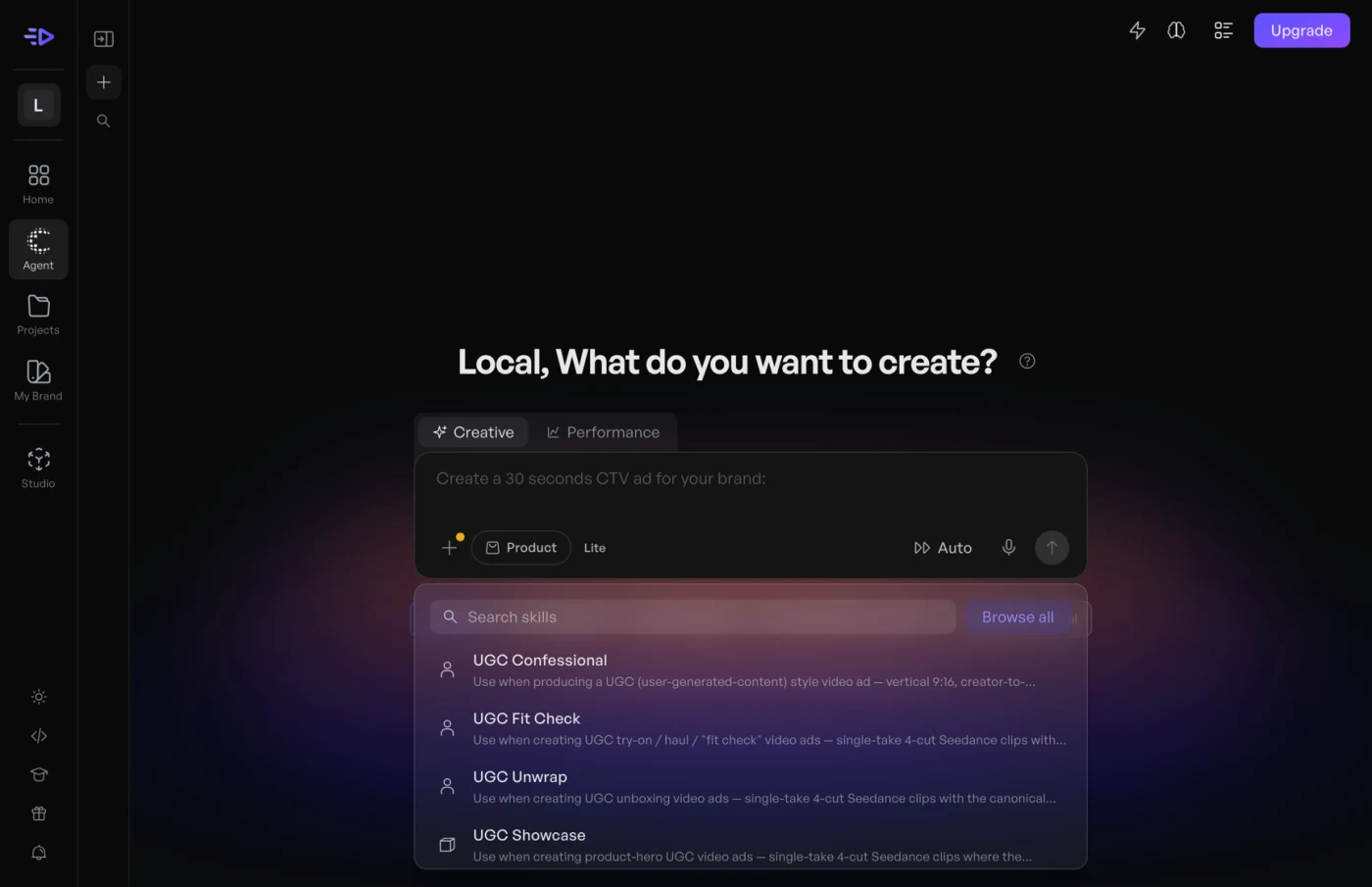
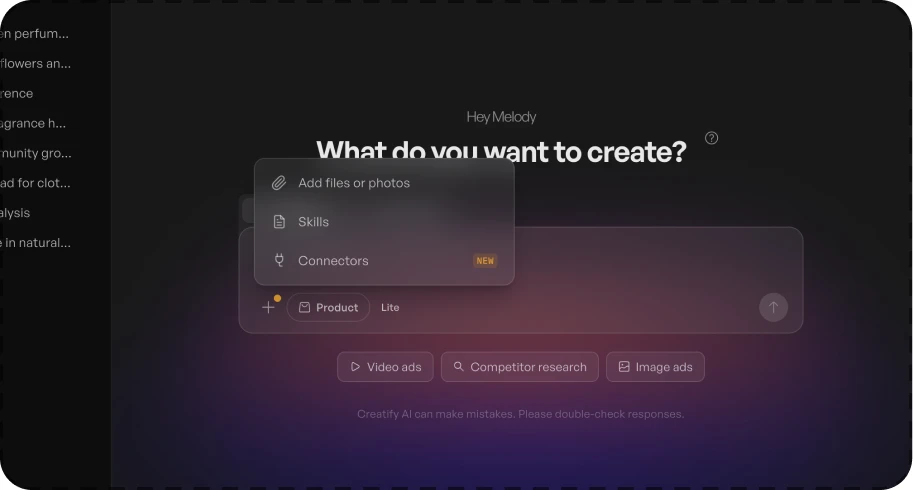
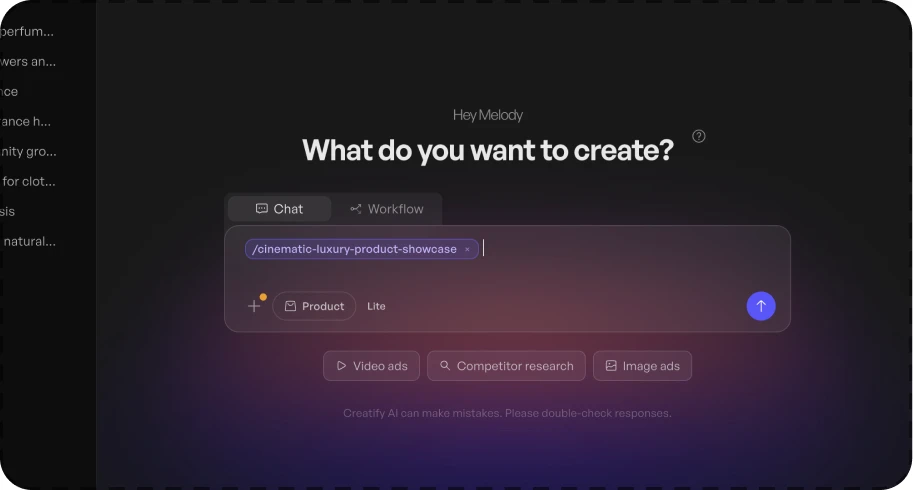
Skills are ready-made instructions that improve the quality of Agent’s output. However, users first had to know Skills existed before they could use them. Skills could only reach them by typing “/” or opening an unlabeled + menu. In fact, only about 1.3% of Agent sessions used a Skill.
Because Skills function like Agent’s other prompt chips, I gave them a dedicated chip and dropdown. Selecting a Skill loads it into the chat bar, with starred Skills listed first.
I also redesigned the hover card to prioritize each Skill’s ideal use cases and style, alongside a preview of how it appears loaded in chat.
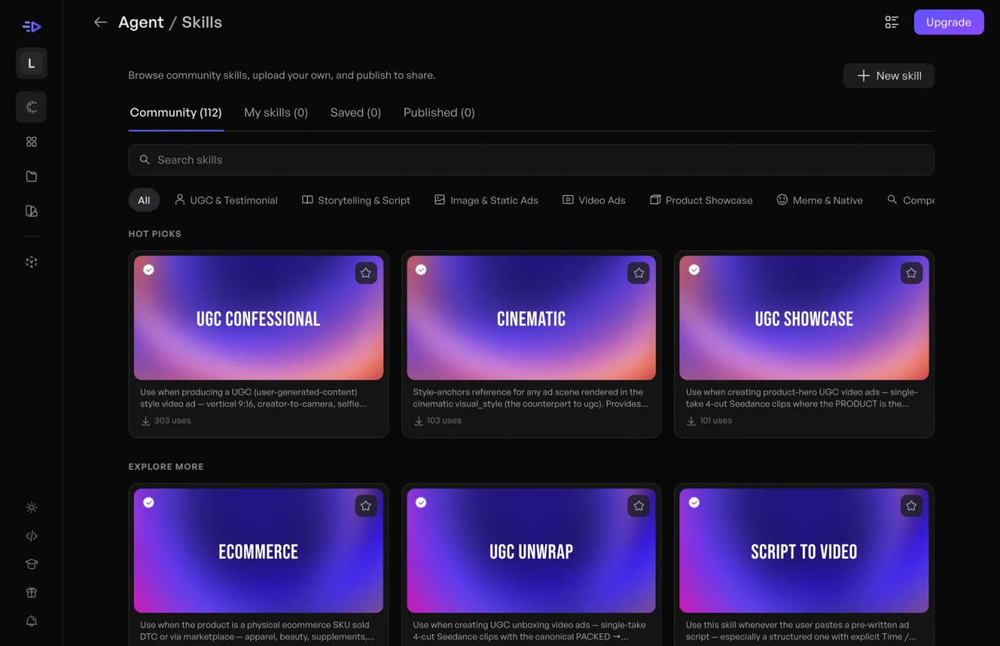
Skills generate visual ads, but hover cards only had room for a name and a line of text. Since every generation costs credits, users wanted to see what a Skill makes before trying it. So I designed Creatify’s first Skills gallery, where every Skill leads with its output.
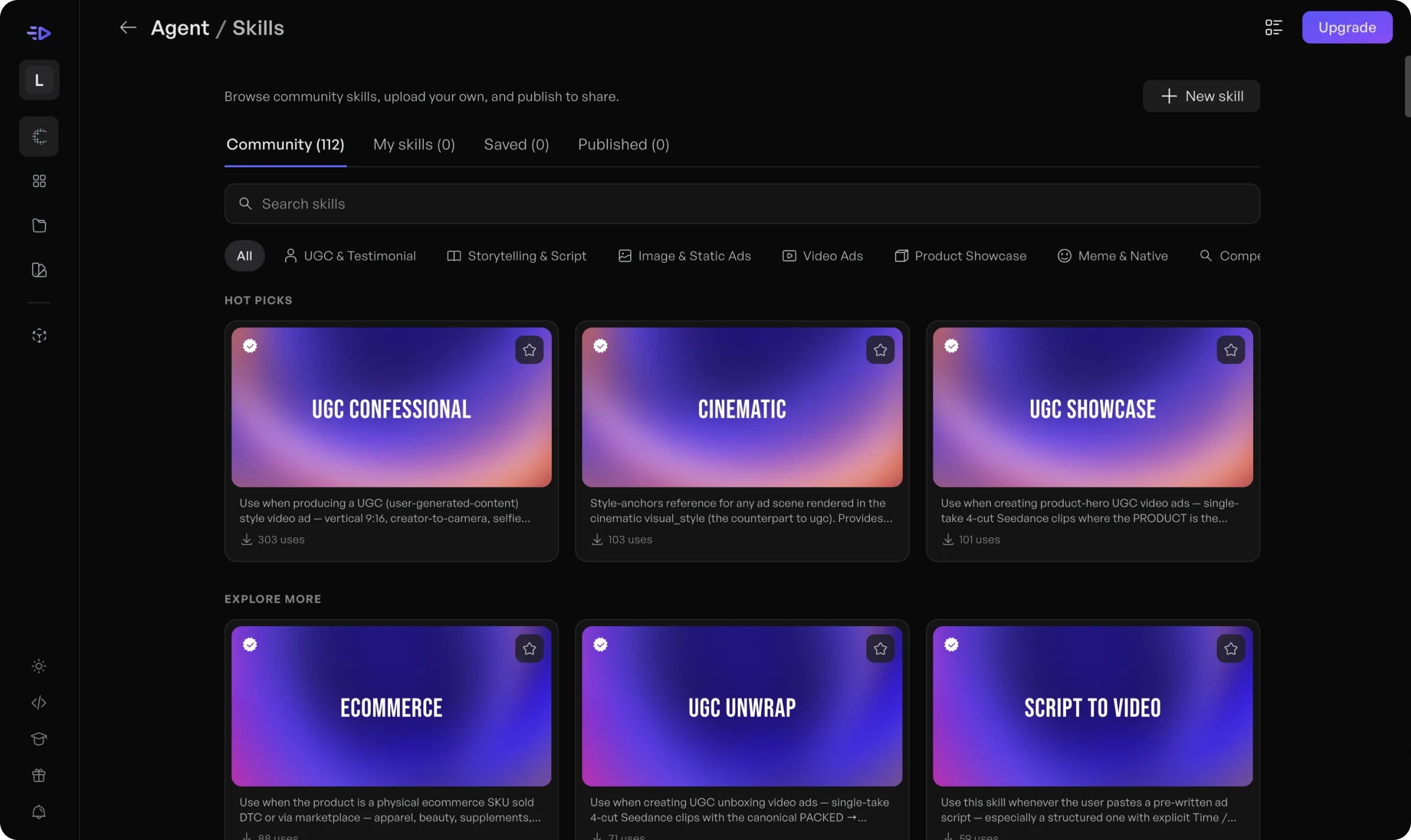
Iteration 1 · Skills gallery
Iteration 1 · Skill detail page
visits a day to gallery
Agent sessions started from a detail page
After later inspection, I realized that the design of the gallery cards and inefficient Skill detail pages limited how easily users could browse.
Post-launch data and a review of my own design revealed three issues:
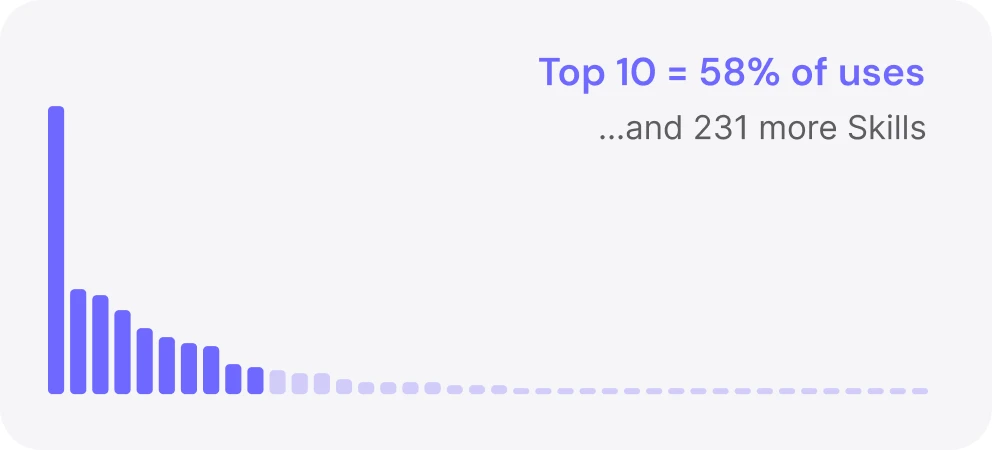
The top 10 Skills accounted for 58% of all uses; 71% were used twice or less.
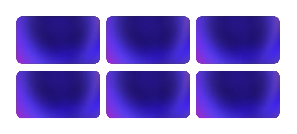
Identical thumbnails and dense descriptions made the grid hard to scan.
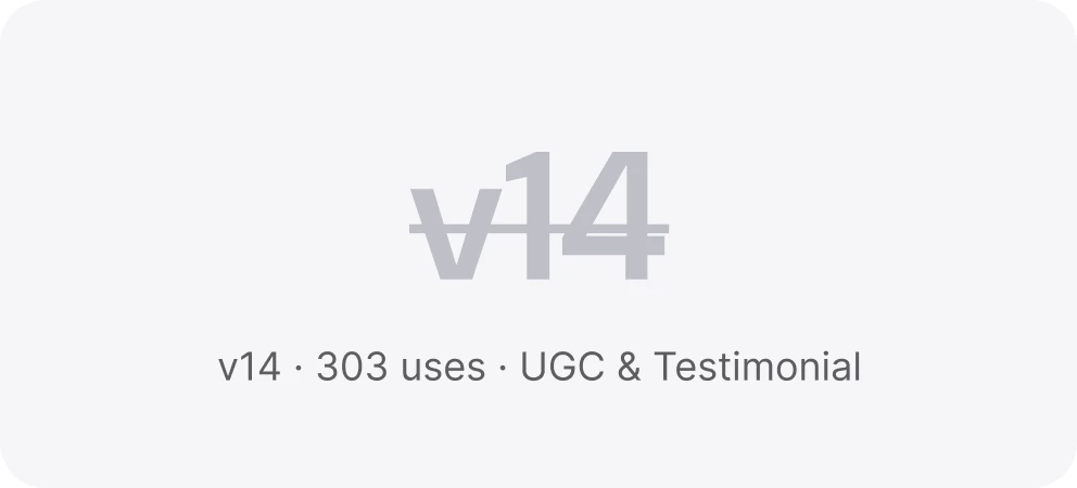
Excessive length and irrelevant details, such as version numbers.
This raised a broader question:
Did users need to leave the gallery at all?
I replaced detail pages with a modal that opened over the gallery, streamlining the browsing experience. It contained all the information as the previous Skill detail page, but reduced scrolling and allowed the user to close it easily.
Example outputs and the chat bar remain fixed, allowing users to compare Skills without constantly losing their place.
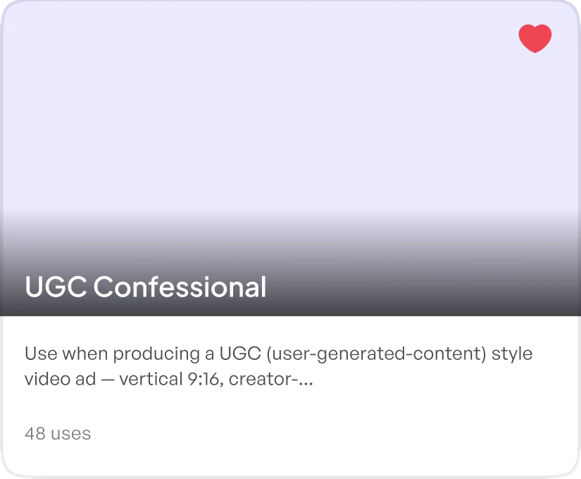
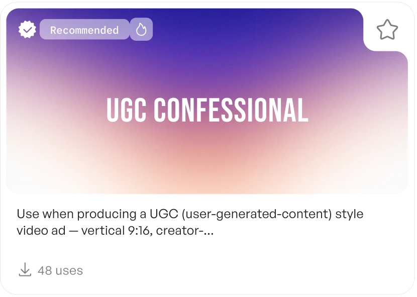
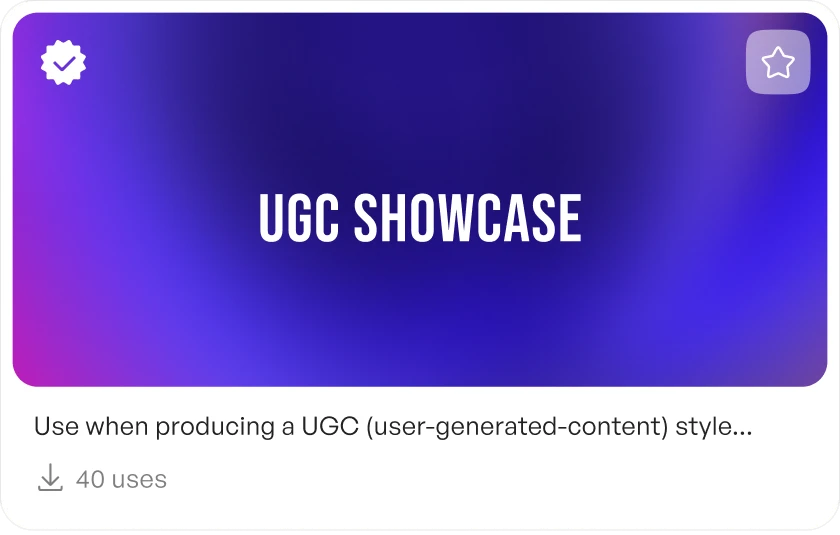

I built this iteration’s front end myself. With guidance from Creatify’s engineers, I moved from Figma into the codebase, using VS Code and Claude to code the interface and ship it through GitHub pull requests. Working in code also let me design motion Figma couldn’t prototype, from the hero’s floating cards to the subtle movement of each card on hover.
increase in Skill sessions in the week following launch
increase in the share of Agent sessions using a Skill (1.17% → 1.36%)
Based on matched seven-day periods. Observational data, not a controlled experiment.
The CEO chose the Skills style for Agent
I presented the final design to the company in a live walkthrough. The CEO identified it as the polished, premium direction Creatify was pursuing and asked me to apply the same visual language to Agent.
Time to tackle the Agent page itself.
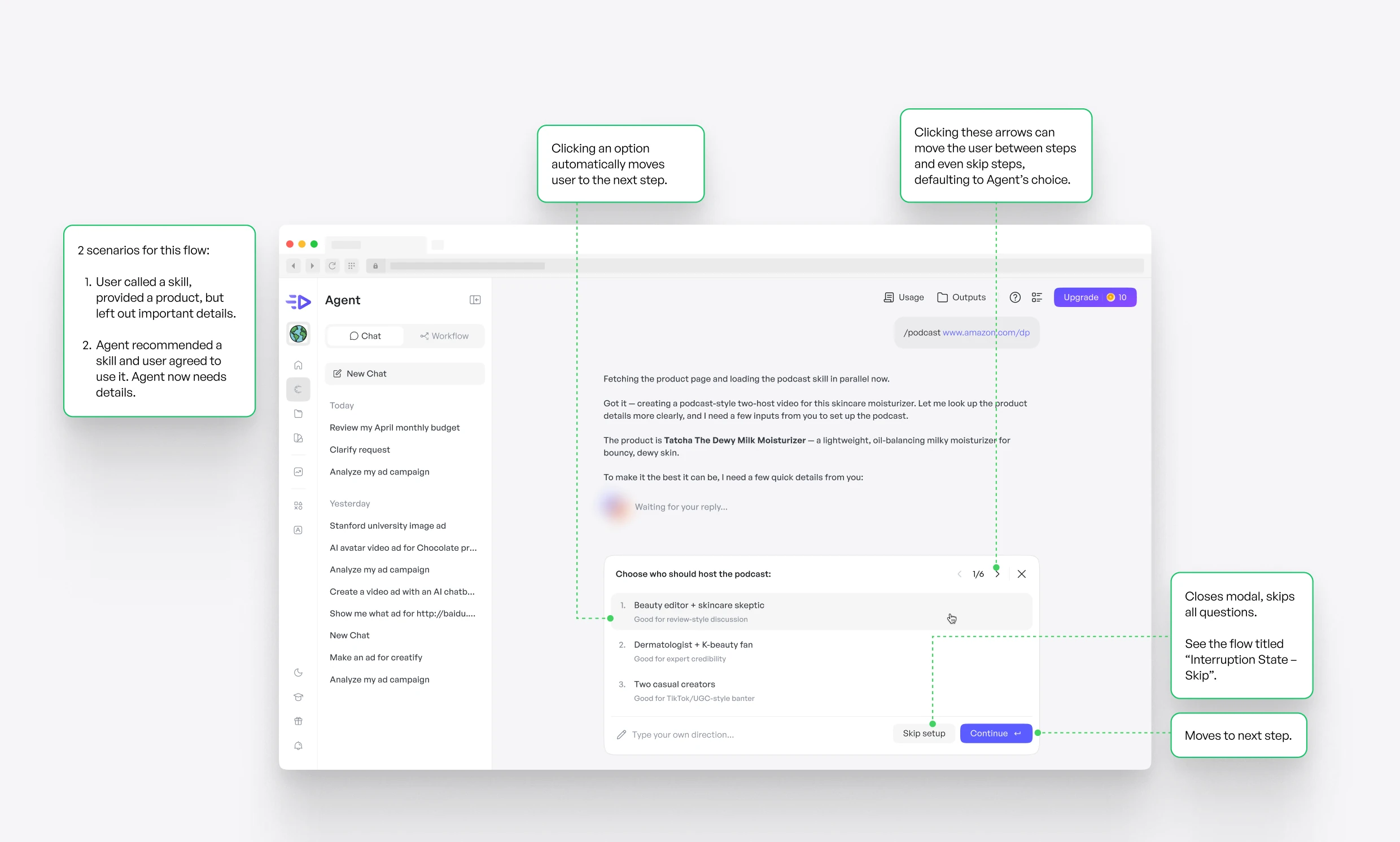
When a prompt was missing details, Agent either guessed, wasting credits on off-target ads, or asked follow-up questions in a long block of text that users had to read, decode and answer by typing. I designed in-chat setup cards that ask one question at a time and take a click to answer.
I conceptualized 12 unique scenarios that would involve set-up cards, including interruption states.
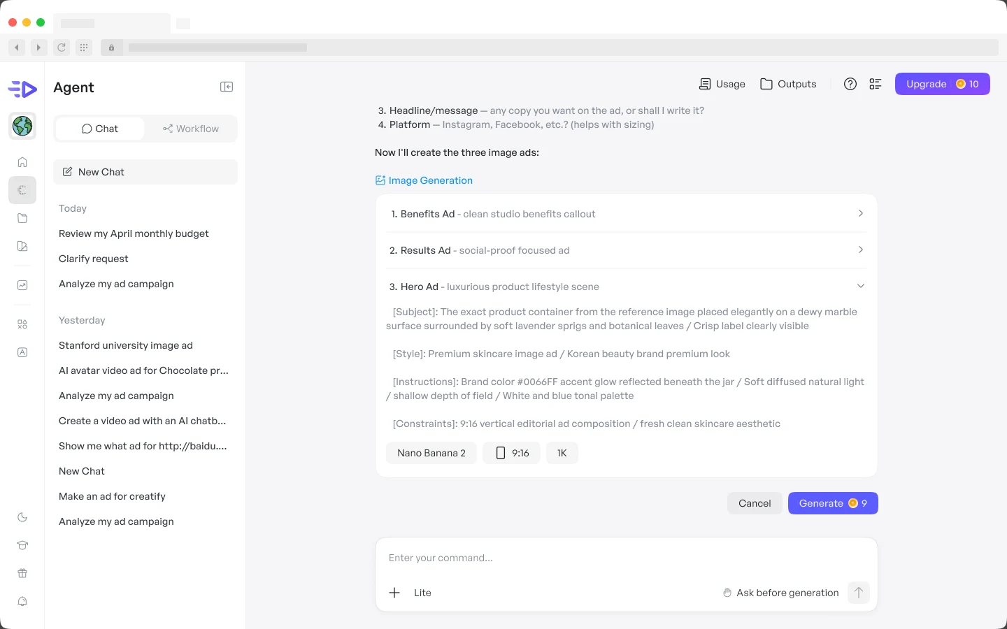
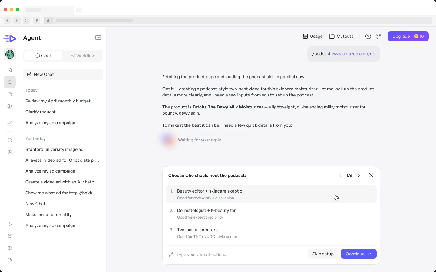
I studied how Claude, Flora, Higgsfield, TapNow and Magnific ask questions in chat. Most offered a single list of options with a way to skip or write something else. Few handled what video ads need, like choosing a voice or uploading a logo, so I designed a card for each kind of answer.
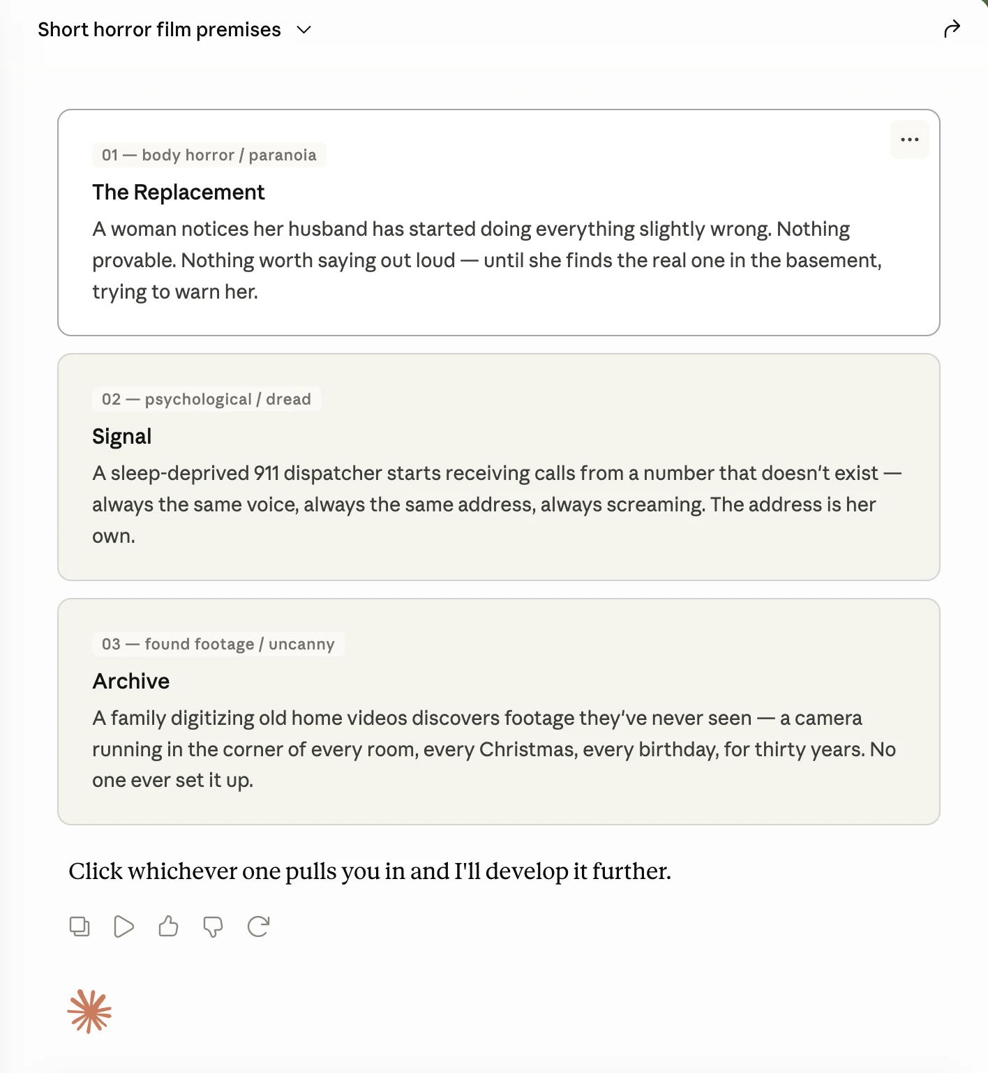
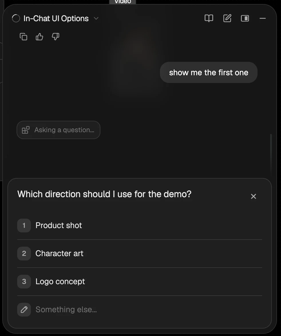
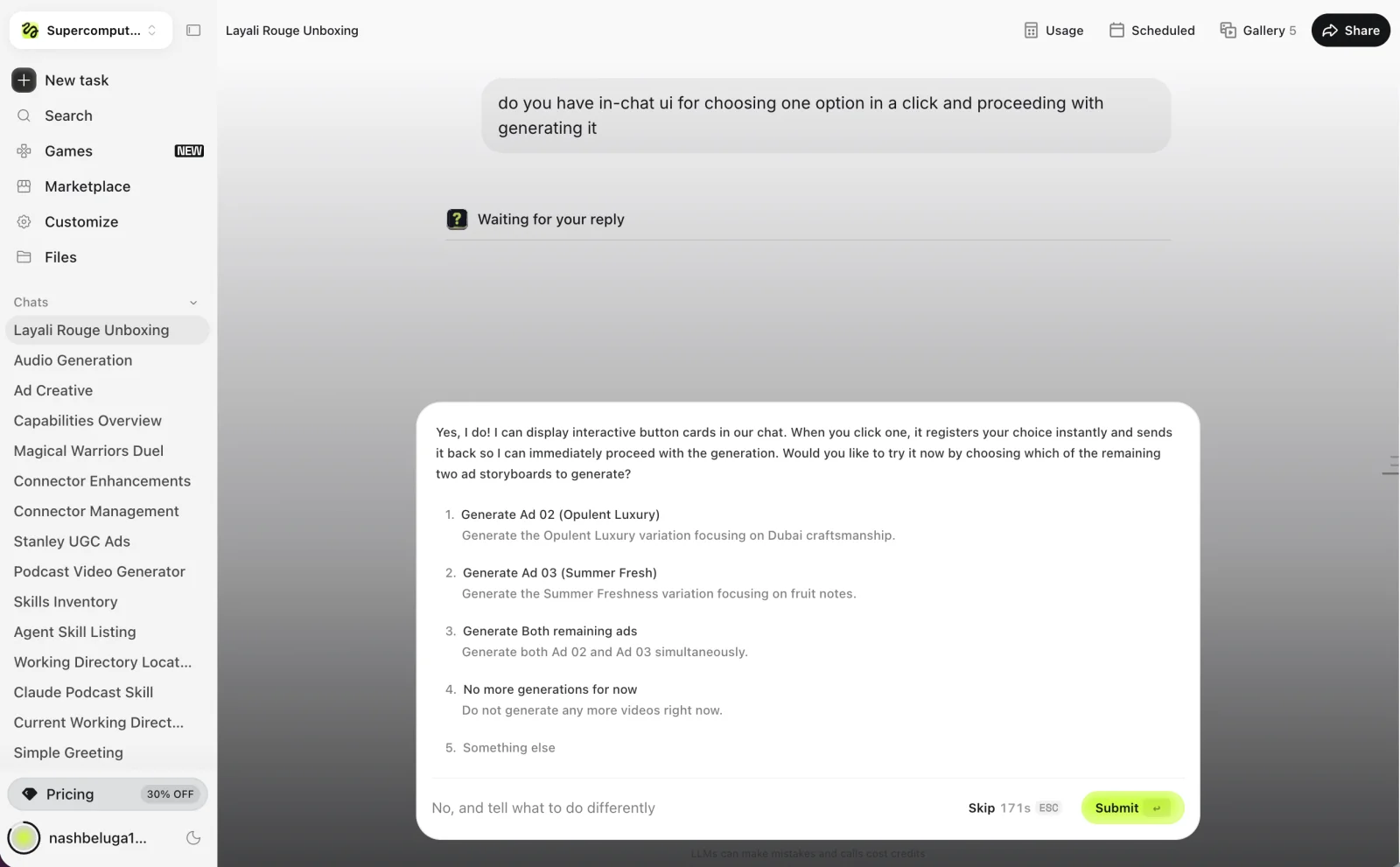
Every card shares one frame: a step count with arrows to move between questions, a field to type your own direction, Skip setup, and Continue. Inside it, the answer takes the shape the question needs.
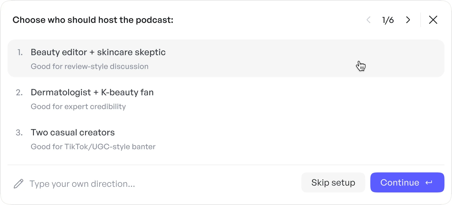
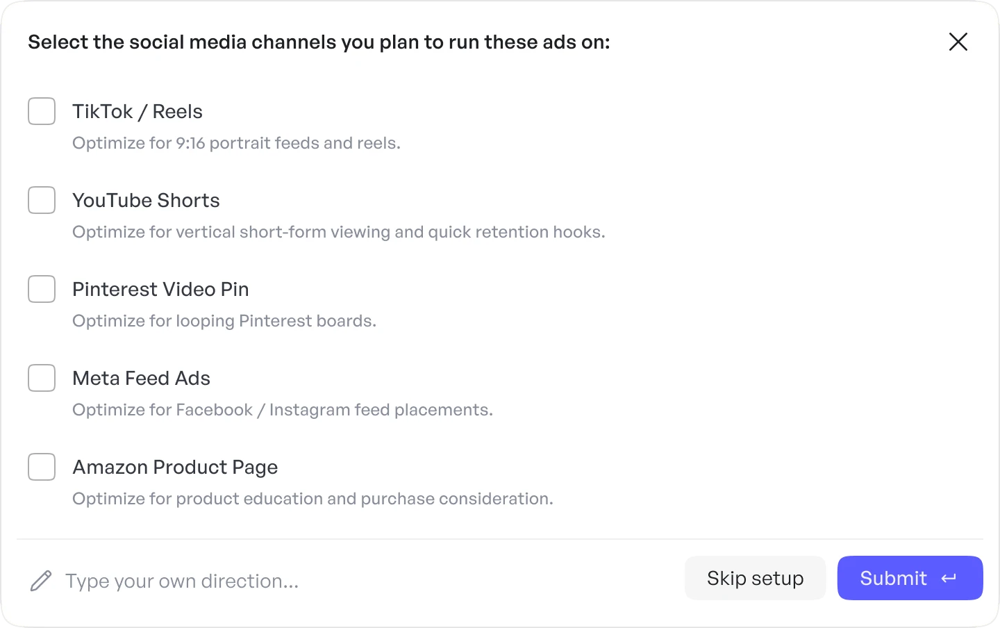
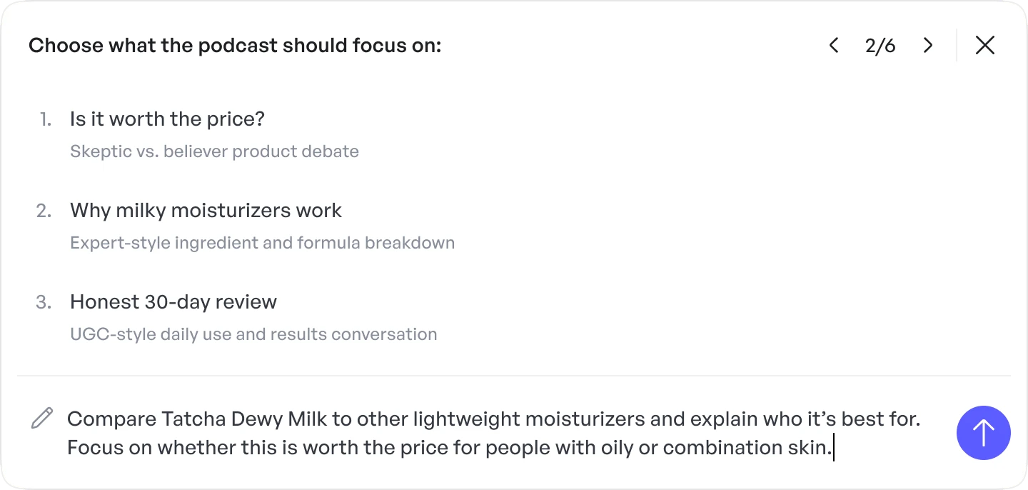
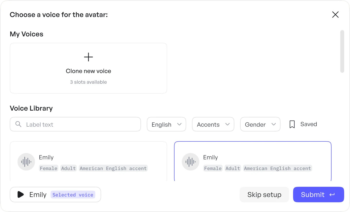
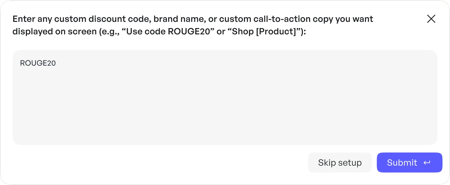
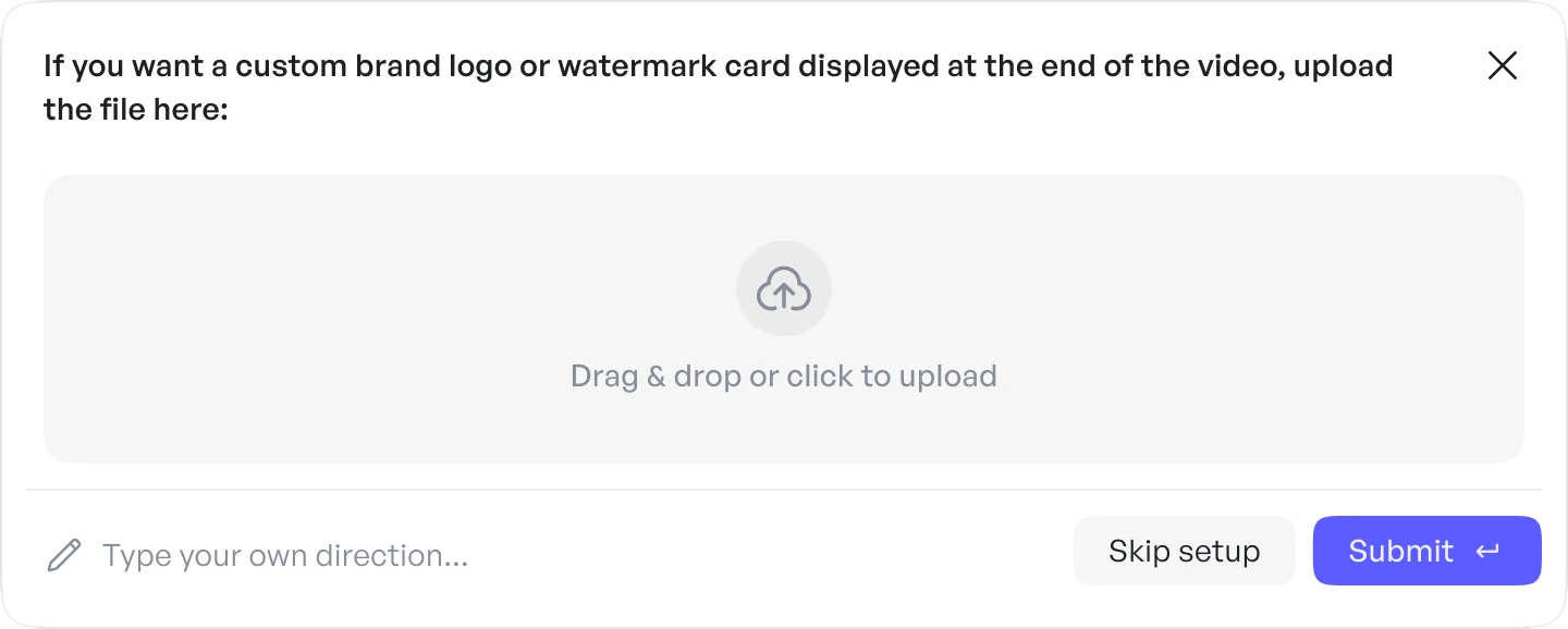
Users can answer every question, skip ahead, or close the card at any point. Skipped questions aren’t lost: Agent fills them in with its best choice.
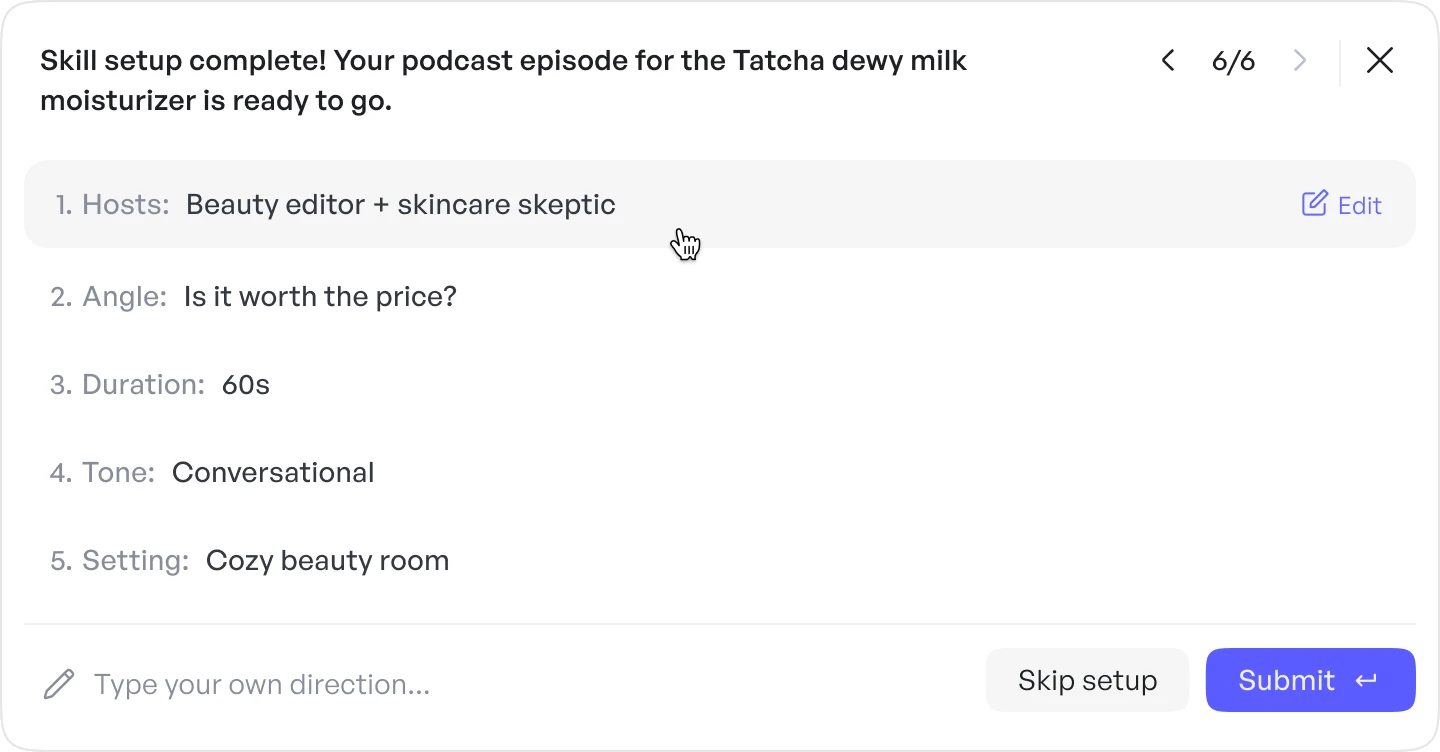
Fill it in yourself for maximum control.
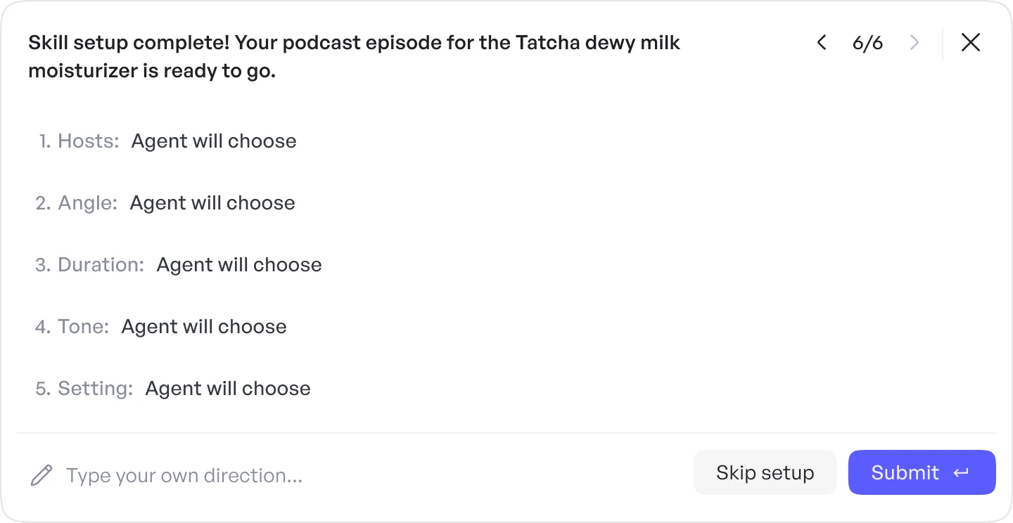
Let Agent infer the remaining decisions and generate.
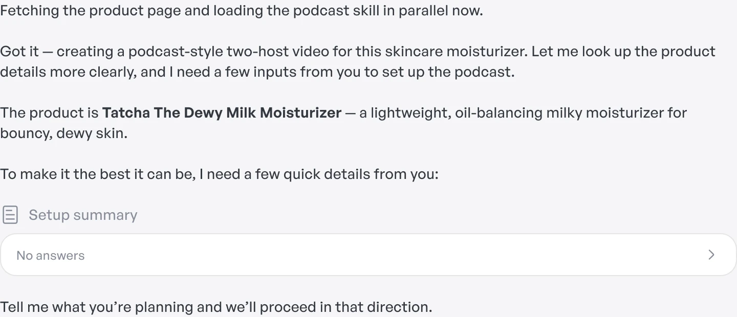
Cancel the workflow entirely.
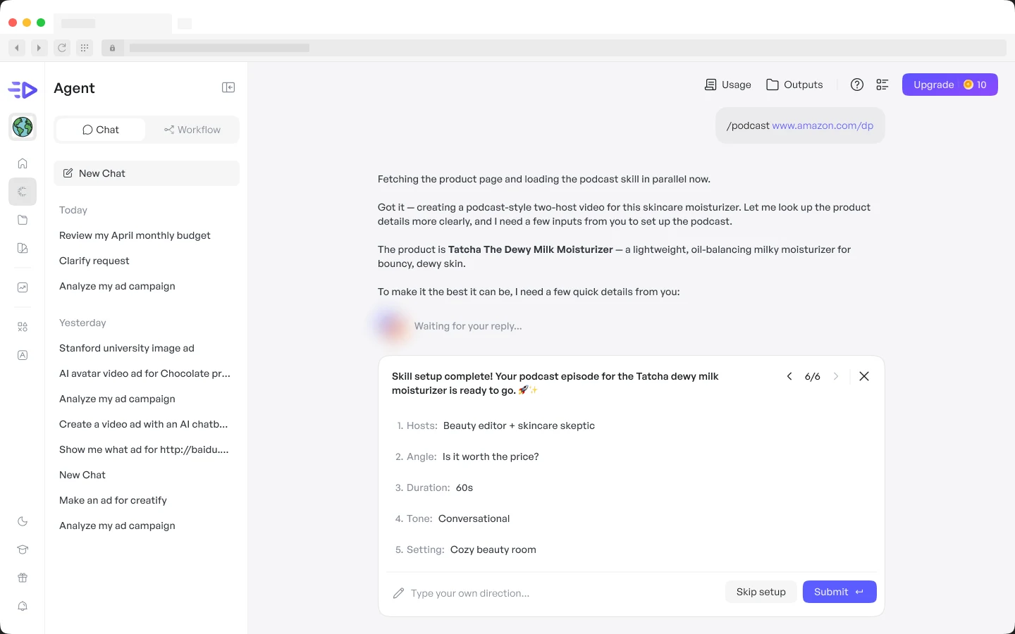
Once setup is done, Agent lists every detail it collected in the chat, marking which answers came from the user and which it chose, so there’s a clear record before anything generates.
Lastly, I recognized that the setup cards were also a chance to make Skills proactive.
When a prompt matches one, Agent recommends the Skill in the conversation, since Skills produce better results than an open-ended prompt.
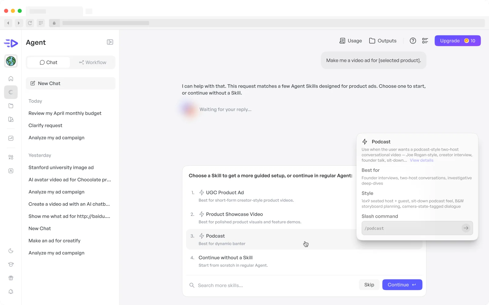
Conversation when flexibility matters.
Interface when precision matters.
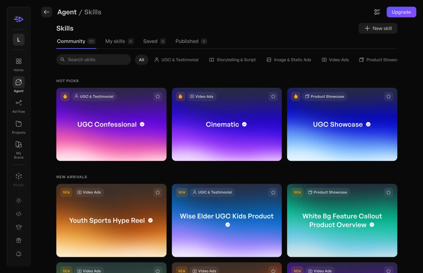
Structure fixed how Agent worked, but it still didn’t feel like Creatify. I redesigned its look and feel around two things users and leadership already liked: the original Agent’s aurora, and the Skills page.
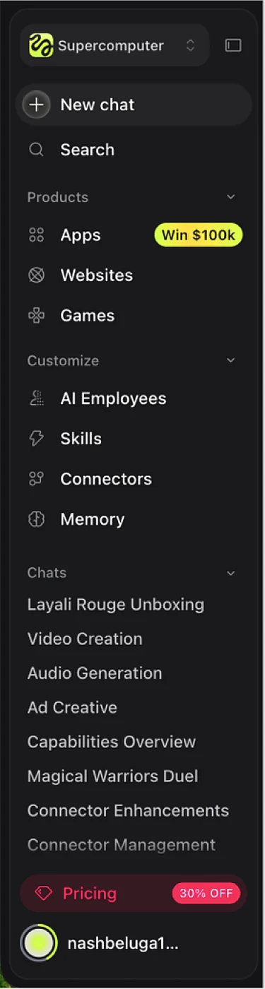
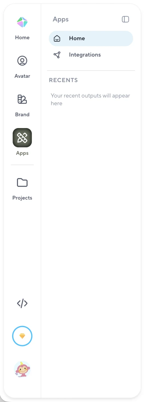
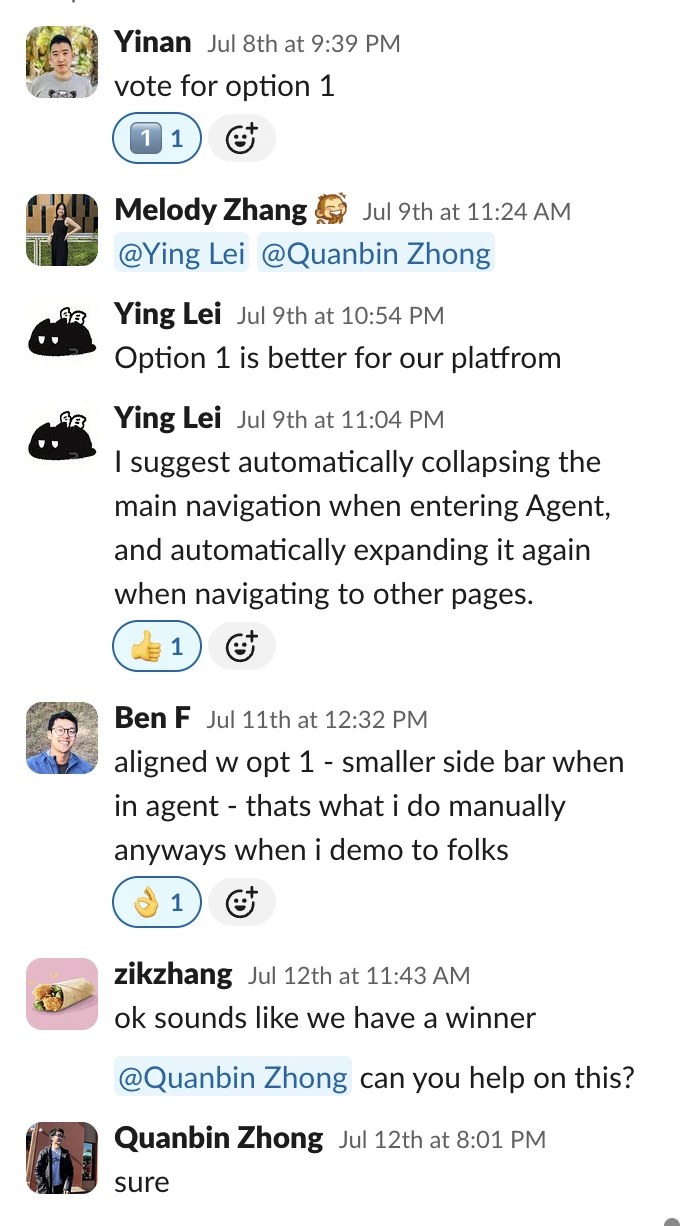
Agent had two layers of navigation: Creatify’s main rail and Agent’s own chat sidebar. I worked on both, months apart.
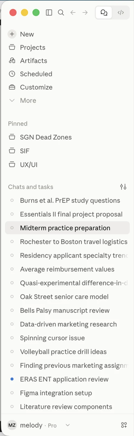
After auditing how Figma, Higgsfield, HeyGen and Claude handle layered navigation, I proposed a contextual rail that keeps global navigation reachable while giving Agent priority.
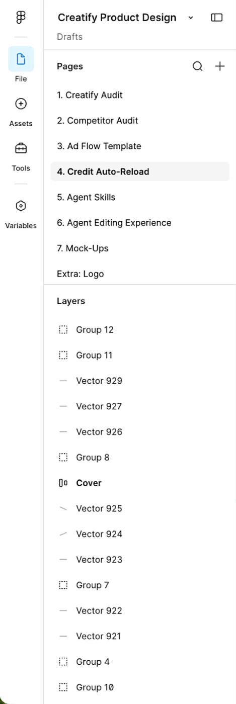
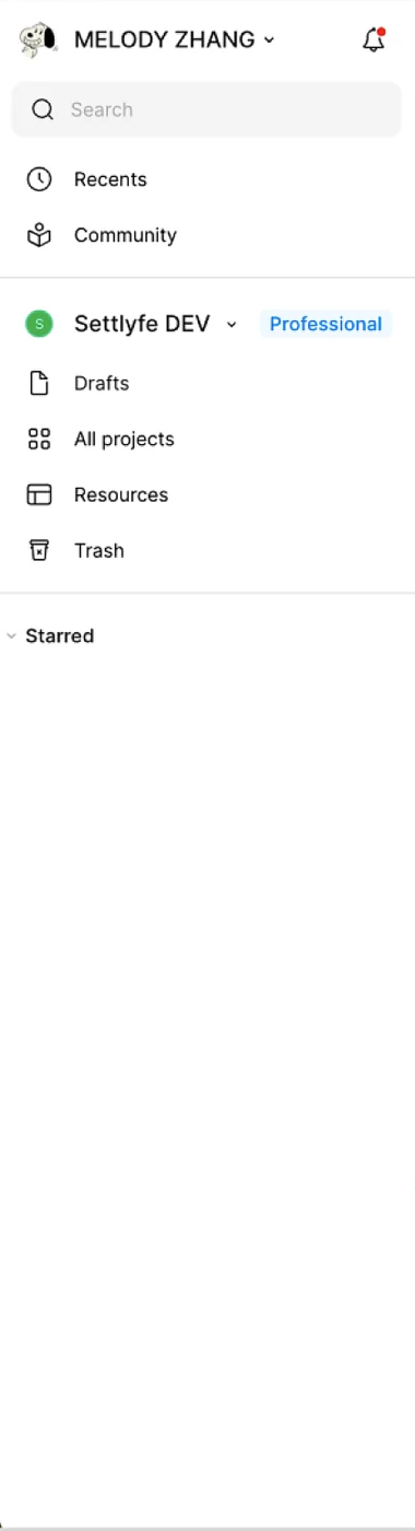
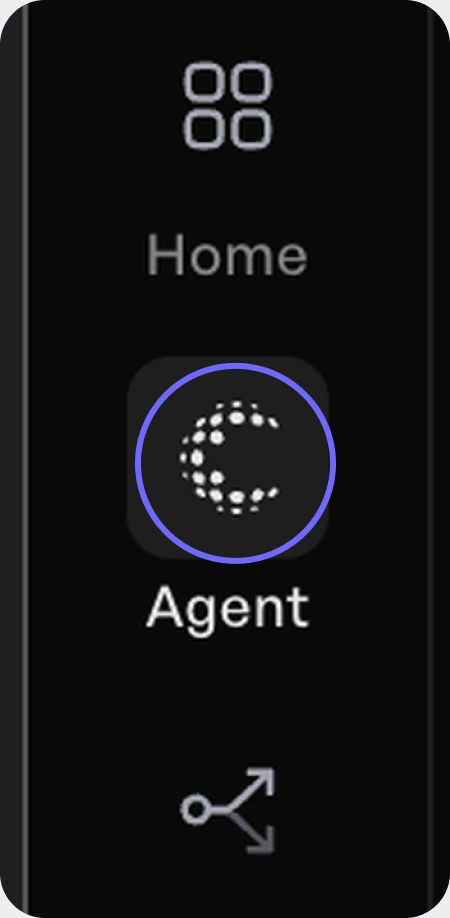
While rethinking the sidebar, one detail stood out: Agent’s icon. Its intricate, dotted style stood apart from the simple line icons around it. It was a stylized “C” for Creatify, but Agent is one tool within Creatify, not the brand as a whole, and it was still building its own reputation. Agent needed an icon of its own.
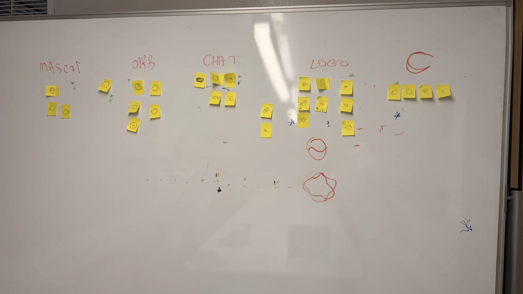
With Abed, our lead visual designer, I explored ideas through rapid sticky-note sketching. We grouped the sketches into five themes, then voted our way down to a handful of finalists.
The team chose my concept: a chat bubble whose ellipsis doubles as a pair of eyes, reflecting Agent’s conversational nature, with an AI sparkle for generation, a symbol already used across Creatify’s icons.



Agent’s homepage is the first screen most users see.
The existing homepage centered on a composer and prompt suggestions. It worked, but it still asked users to understand Agent before Agent had shown much of its range. Not only that, but trust Agent with their credits.
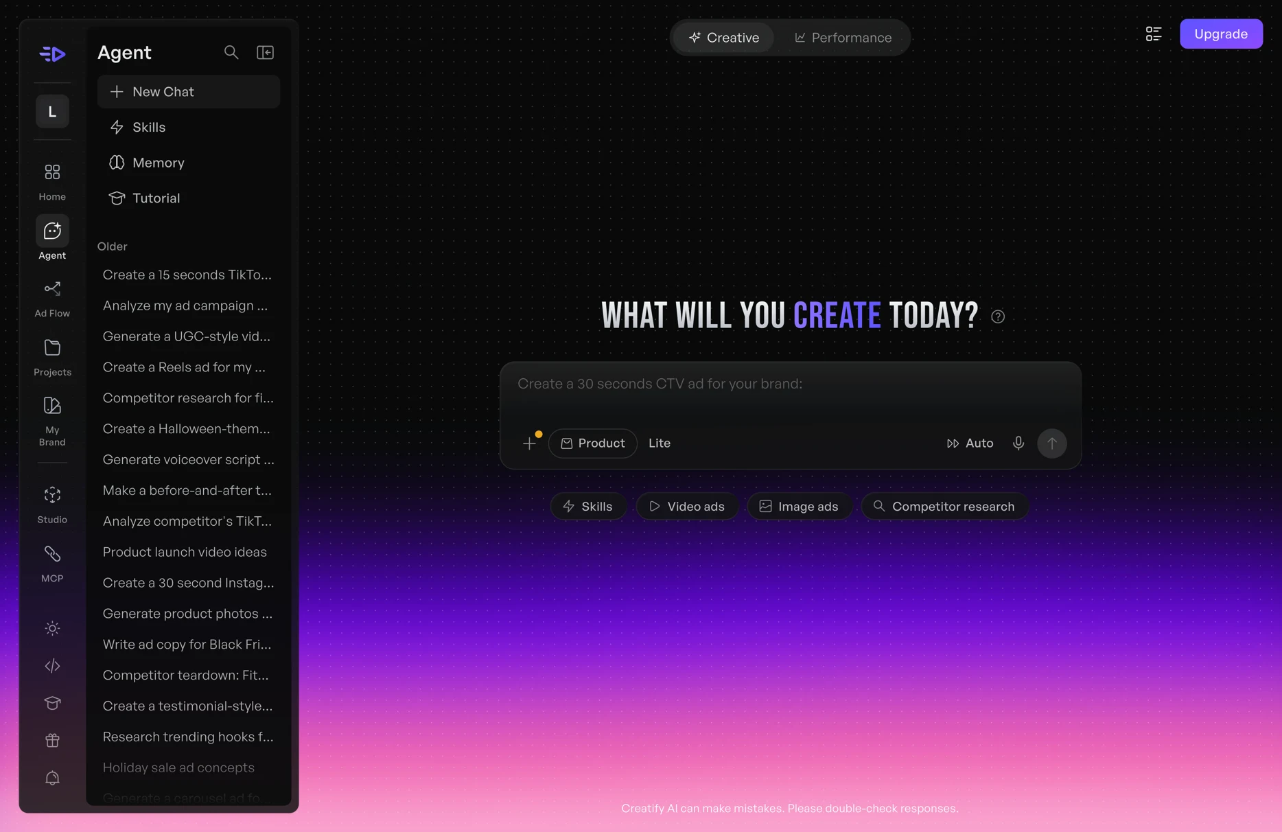
Kept the familiar chat-first structure and improved hierarchy and personality:
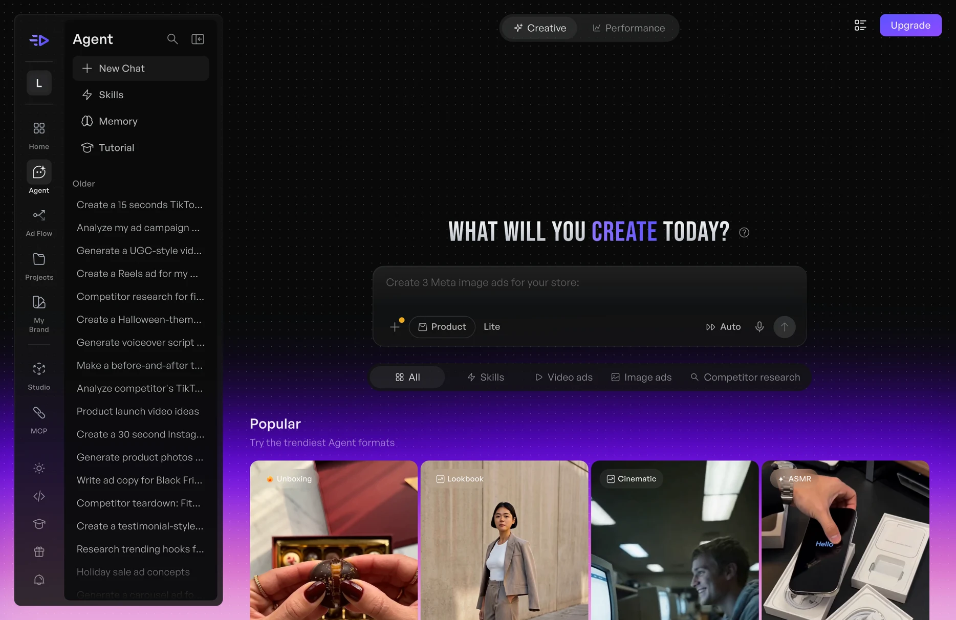
Questioned whether an empty prompt box should be the main introduction to Agent. Instead of asking users to invent a prompt, Agent shows strong outputs by category, so users can start from inspiration.
Direction A was familiar, low-risk and quick to ship, but new users would still face an empty prompt. Direction B answered the question users kept asking on calls (“can it handle my product?”), but needed example content and backend work. My recommendation: ship A’s polish now, and test B with new users. Discovery was the core problem in our research, but B’s cost made it a bet worth validating first.
Discovery should happen before prompting, not only after it.
I presented the coded prototype to the CEO. He wanted to bring the new visual style into production right away, and liked the reasoning behind Direction B, though as a conceptual prototype it would need testing first.
Creatify has significantly evolved the design since, as fast-moving teams do.
A powerful feature has limited value if users can’t find it or understand why they should use it.
Cards, galleries, selectors, previews, and forms can make AI systems more understandable without sacrificing conversational flexibility.
I started using analytics to diagnose problems. By the end, I saw instrumentation as part of the product, planned alongside the interface so future iterations rest on real behavior.
Learning to ship my own designs changed how I work: I could test ideas at full fidelity, especially motion, and hand off less. It also showed me how much good engineering mentorship speeds up that leap.
Creatify already had powerful AI capabilities. My work focused on making them easier to discover, understand, and use.
Fin.